Warning, this post is going to be about one of the most boring topics possible, font choice.
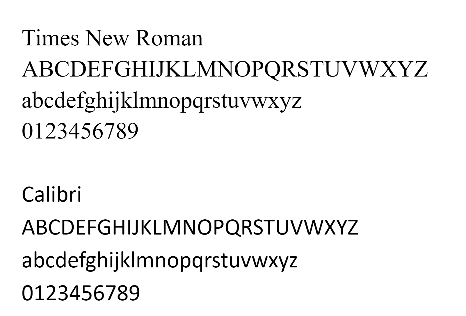
The Washington Post reports the State Department has ordered a shift in font choice from Times New Roman to Calibri. The justification is that a serif font like Times New Roman (serifs are the little lines that attach to the ends of some letters in some fonts) is less accessible for readers with vision or reading problems than a font like Calibri that lacks serifs (known as sans serif).
Most people I’m sure don’t care. But a few people are very, very mad.
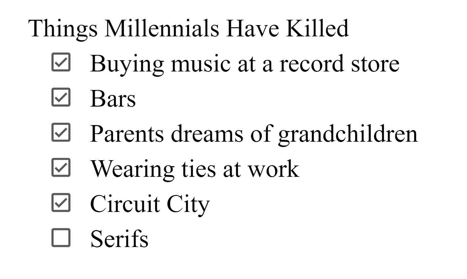
The difference between serif and sans serif fonts is one of those things designers can and do have very strong opinions on. Both have strengths and weaknesses, and despite claims that millennials have killed serifs, both are in use. Sans serif fonts often look cleaner and modern, whereas serif fonts look more authoritative and traditional. Serifs can make telling the difference between letters in small text easier, whereas sans serifs are easier to read on screens with small resolution where those detailed serifs do not show very well.
The guidance I’ve heard is to use sans serif fonts for titles and serif fonts for bodies. You may have noticed that is what I do here.
But what about accessibility? That is the State Department’s reasoning for dropping serifs. Surely small aesthetic preferences are less important than making sure that disabled users can read your document, right?
The Post article mentions serif fonts are hard for screen readers. That sounds like complete nonsense. Screen readers don’t care what font text is. If you are dealing with images of documents then maybe it will impact OCR, but I can’t find anything showing serif fonts as a group do poorly there. It’s probably going to depend a lot on the software being used. But sans serif fonts commonly have some letters that look similar, such as a lowercase ‘l’ and an uppercase ‘I’. That’s something that can trip up OCR programs.
Another argument I hear is that sans serif fonts are easier for dyslexic people. This too sounded fishy to me. But unlike the screen reader theory, this I can at least find some supporting evidence. There are many style guides which argue this, and some even cite a scientific study showing improved readability for dyslexic people with sans serif fonts.
Unfortunately there is a difference between citing a study and reading a study. It looks like most of these guides only did the former.
This study, done by Luz Rello and Ricardo Baeza-Yates, tested 48 people with dyslexia and 12 different fonts, including two specifically designed for dyslexic readers (Calibri was not one of the tested fonts, so the State Department decision is already off to a rocky start if they are using this as their justification for the change). The researchers tested both reading time and fixation time, the later of which is considered a good proxy for how easy text is to read.
There was no statistically significant difference between serif fonts and sans serif fonts in terms of reading time. There was a statistically significant difference in fixation time, with sans serif fonts being slightly lower.
So case closed, right? The two different fonts are equal in reading speed, and sans serif fonts are easier to read.
Not so fast. Let’s look at the study a bit closer.
First thing to note is the equipment that was used. As I mentioned earlier, serif fonts are often harder to read with low screen resolutions. This study was done using a 17 inch monitor with a resolution of 1024×768. That’s the resolution of XGA. Today we have 4k screens, with a resolution of 4096×2160.
But hey, not everyone has a new monitor. I wouldn’t be surprised if the State Department was dealing with a lot of older hardware.
So lets look at the effect serifs had on fixation time. Serif fonts had a mean fixation time of 0.26 seconds, sans serif fonts had a time of 0.24 seconds. That’s not a huge difference.
But hey, it’s hard to translate that number into how easy something is to read. And surely if serifs add even a small amount of difficulty, it’s worth it to change, right?
I would buy that argument, except serifs wasn’t the only font characteristic they looked at. They also looked at monospace fonts. Fixed width monospace fonts also had a statistically significant difference, only this time it was much greater. It went from 0.26 seconds for proportional fonts to 0.22 seconds for monospace fonts. In fact the font with the overall shortest fixation time was Courier, a monospace serif font.
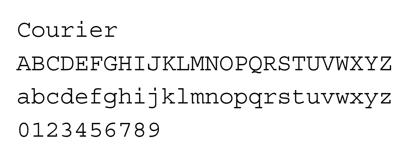
That’s right. The study everyone cites showing how sans serif fonts are easier for people with dyslexia to read found that a serif font was the easiest font for people with dyslexia to read. So if the State Department really wanted to be accessible, all their documents would look like they were typed on a typewriter from the 50’s. Which incidentally it did until 2004.
There is another problem with sans serif fonts that I touched on before. Certain letters, most notably capital ‘I’s and lowercase ‘l’s often look very similar. Usually a reader can tell the difference based on the context. But this is a feature that is often used to spoof things like URLs. You think you are clicking on a link to lakeviewlending.com but you are really going to iakeviewiending.com. I would hope that for an organization like the State Department, security would be a much more important consideration than the aesthetics of a font.
State probably still uses Wang computers. Speaking of which, maybe we should all just transition to Chinese characters. Makes it much easier for the spies.